My Role
UX Researcher/Prototyper
During the process, I assisted in conducting interviews, coming up with the user's problem, creating affinity diagrams. When my team and I started the prototyping process, we started by designing a wireframe on FigJam. I designed a wireframe of our two options for the budget feature. After, we conducted a few more interviews to get the user's feedback. Once we got enough information, we proceeded with our prototype on Figma. I designed the prototype for the "Filter" and "Budget" page.
Product Problem Space
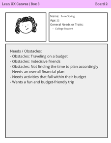
The current state of travel organization has focused primarily on all-in-one travel solutions. What existing products/services fail to address is time management and reducing planning stress. Our product/service will address this gap by generating a full itinerary for the user. Our initial focus was individuals who plan brief trips. We'll know when we are successful when we see positive referrals to other travelers. To find the solution my team and I came up with two personas, but we decided to go with Susie Spring because we felt that she fit the criteria. Provided below is our proto-persona on Susie Spring.
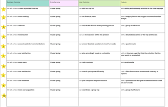
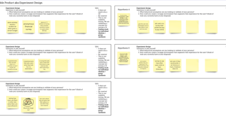
For the hypotheses part of our sprint, we combined our assumptions and created a hypothesis statement. We then placed our hypothesis statements on sticky notes, and ranked them from highest to lowest on perceived value to the business/end user. After we reordered our hypothesis table based on our prioritization matrix. We then picked 5 hypotheses, and answered the questions "What behavioral assumption are you looking to validate of your persona?" and "How could you create a scrappy environment that augments that experience for the user?" for each hypothesis.
PlanIt App


Role:
UX Researcher
Tools:
Figma, FigJam, Microsoft Teams
Deliverables:
UX Research Prototype
Duration:
4 Months
Overview



Solution
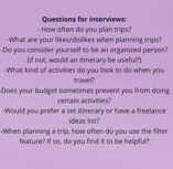
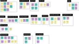
During Sprint 1, my team and I conducted interviews with 3-4 users. We asked them a set of 7 questions, as we were interviewing we came up with more unplanned questions. However, it helped us get more detailed feedback. After the interviews, we completed an affinity diagram. Provided below are the set of interview questions and affinity diagram.


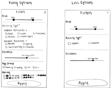
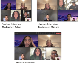
After the interview process, and completing the affinity diagrams. This helped us get started on sketching and wireframing of the filter feature that was talked about during interviews. I sketched out a "more options" and "less options" filter feature. This sketch was used for the next interview to present to the interviewees. Once we were done with those interviews we concluded that our interviewees preferred the "more options" feature. Which led us to get started on the wireframing for that UI feature.
Sketch
Filter Feature Interviews
Figma Link to Wireframe:


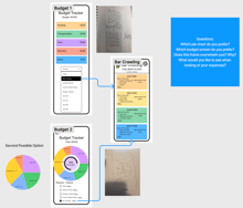
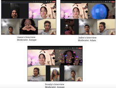
During Sprint 2, we conducted an experiment in a study room where we brought in 3 interviewees. We provided fake money and gave them a budget of $3700. We then asked if they wanted to travel in or out of the country, housing, duration of their stay, transportation, food, activities, and souvenirs. The whole point of this experiment was to see their thinking process when it came to spending money. Even though we were aware that it was pretend, we all still treated it as if it were a real-world scenario. Once we were finished with the experiment, we completed an affinity diagram. This helped us get enough feedback to get started on the wireframing process of our budget feature. I've included for you below the wireframe of the budget feature. As you can see budget #1 doesn't have the pie graph like budget #2. We then presented this wireframe during the interviews, and 2/3 preferred budget #1. As we completed the affinity diagram for this interview, we noticed that many of them liked the pie chart from budget #2. After all of the interviews we were finally able to proceed to the prototyping phase.
Wireframe
Budget Feature Interviews


Results
Before starting on our prototype we talked about the name of the app, the theme we wanted, and who works on which part. Even though we didn't have a name for the app beforehand, conducting interviews and doing UX research made the naming process easier. We also took the time in our meeting to figure out what theme we wanted, we each voted and whichever theme had the most votes then that's the theme we were going to use. I think we did a good job at communicating, throwing ideas out there, and being willing to compromise. My part was to work on the budget and filter page of PlanIt.
BUDGET FEATURE
For the budget feature, we decided that combining the pie chart and the accordions would be useful. This way the user could be able to see the percentage of their money spent, and below that under each category, they would be able to see what they spent their money on. I color-coded each category onto the pie chart and accordion. I divided it into 5 categories "Housing, Transportation, Food, Activities, and Other". Under the "Housing" category, when the user clicks on the down button, in this case, all of their housing information will appear below. In this case, the user rented an Airbnb, therefore they'll be able to see the information on dates, guests, pricing, and total spending. Under the "Transportation" category, will appear what the user chose. In this case, the user is renting a car, therefore they will get to see how much they spent.
filter feature
For the filter feature, we decided on the "many options" feature which is what I did. For the circles on the price and distance range, I made them the same color as the theme of the app; pink and orange gradient. As well as the star ratings and "Apply Filters" button, I made them a pink and orange gradient. We included an "Activity Type?" section, this way the user can decide if they want an indoor/outdoor activity, and the vibe of the activity. For example, if the user decides on an outdoor activity, they can choose a nature, sporty, thrill-seeking, or stadium activity. If this were a running app then it would have more options. We also included an "Age Group" section and divided the groups into "Family Friendly, 18+, 21+" this is useful for users of all ages.
Overall, the prototyping phase challenged me to explore new concepts. It was a fun and learning experience, especially when it came down to the UX research phase. Not going into class and taking the time to schedule meetings, interviews, and experiments made the process feel real. As a team, I felt that even though we come from different background and have different aesthetics we did a great job at taking advice and compromising with one another.
Project Summary
In conclusion, our problem was that today's traveling apps don't address time management and reducing planning stress. Therefore, creating an app with features such as the Budget Page, Filter Page, Itinerary Page, etc., created a solution to the users' problem.